Not every WooCommerce store needs a traditional checkout page.
For many businesses, WooCommerce’s default setup, complete with cart pages, payment gateways, and automated order processing, works perfectly. But in certain business models, especially those involving limited inventory and multi-channel sales, the standard checkout flow can create more problems than it solves.
Recently, we worked with a small electronics retailer that sold used devices, primarily single-unit items, across multiple platforms. The store was built on WordPress with WooCommerce, and at first glance, a standard eCommerce checkout seemed like the logical setup.
However, after analyzing the operational risks and friction points, we made a strategic decision:
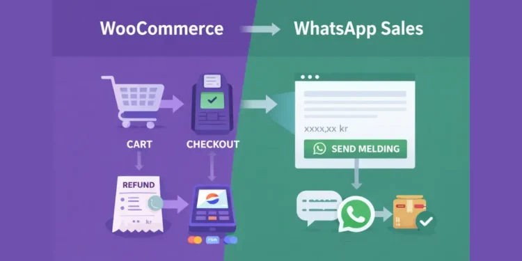
We removed WooCommerce checkout completely and converted the store into a WhatsApp-only sales model.
In this article, we’ll explain why that decision made sense and how it was implemented cleanly without breaking product structure, SEO, or site usability.
Table of Contents
The Problem with Traditional Checkout (For Small Inventory Stores)
The client’s business model was simple:
- Used electronics
- One unit per product
- Sales happening across multiple channels (website + marketplaces)
This is where traditional checkout becomes risky.
When you’re selling a single physical unit across different platforms, timing matters. If a device sells on a marketplace but remains available on the website for even a short period, a customer could place an order for something that is no longer in stock.
That creates a chain reaction of problems:
- Refund processing
- Accounting reconciliation issues
- Payment gateway disputes
- Customer frustration
- Loss of trust
Even worse, automated payment capture means money is collected before manual verification, making the situation more complicated than it needs to be.
In this scenario, automation did not increase efficiency; it increased operational risk.
WooCommerce was doing exactly what it was designed to do. The problem wasn’t the tool. The problem was misalignment between the business model and the checkout system.
Automation wasn’t helping. It was adding friction.
The Strategic Decision
Instead of forcing a fully automated eCommerce workflow, we stepped back and asked a simpler question:
What if we keep WooCommerce for product management, but remove checkout entirely?
WooCommerce is more than just a payment engine. It provides:
- Structured product management
- Image galleries
- Pricing logic
- SEO-friendly URLs
- Category and taxonomy control
There was no reason to remove the product system. The only misaligned component was the checkout process.
So the approach became clear:
- Keep product structure
- Keep SEO architecture
- Keep pricing visibility
- Remove cart functionality
- Remove payment gateways
- Replace “Add to Cart” with WhatsApp-based contact
The result was a controlled, conversation-first sales flow.
Instead of automated orders, customers now initiate direct communication before any transaction occurs.
This provided several immediate benefits:
- Full inventory control
- Real-time confirmation before sale
- Direct buyer communication
- Zero payment plugin conflicts
- Reduced technical complexity
- Lower risk of refund disputes
Most importantly, the system now matched the business model.
Instead of bending operations around a checkout system, the checkout system was removed and replaced with a workflow that actually fits limited-stock, multi-channel selling.
Turning WooCommerce into WhatsApp-Only
The goal was simple:
Keep WooCommerce as a product engine.
Remove it as a transaction engine.
We wanted:
- Products fully manageable in the backend
- Clean product pages
- No cart flow
- No checkout
- No automated payment capture
- A direct WhatsApp conversation instead
Here’s how it was implemented.
Step 1: Remove “Add to Cart” Buttons
WooCommerce renders “Add to Cart” in two primary contexts:
- Product grid (shop/archive pages)
- Single product pages
Instead of hiding buttons with CSS (which only affects visuals), we removed the underlying WooCommerce hooks.
		add_action('init', function () {
		remove_action(
		'woocommerce_after_shop_loop_item',
		'woocommerce_template_loop_add_to_cart',
		10
		);
		remove_action(
		'woocommerce_single_product_summary',
		'woocommerce_template_single_add_to_cart',
		30
		);
		});
Why remove hooks instead of using CSS?
- Cleaner implementation
- No leftover cart logic attached to buttons
- No accidental cart interactions via AJAX
- More future-proof
This ensures WooCommerce no longer renders transactional controls in the UI.
Step 2: Add a Custom WhatsApp CTA
With cart buttons removed, we replaced them with a controlled WhatsApp call-to-action.
The CTA dynamically generates a prefilled WhatsApp message including the product name and link.
Product Grid Button
		echo '<a href="'
		. esc_url($url)
		. '" target="_blank" rel="noopener">
			<i aria-hidden="true"></i>
			<span>SEND MELDING</span>
		</a>';
This version is intentionally:
- Short
- Action-oriented
- Uppercase for clarity
- Icon-driven for recognition
On grid layouts, brevity improves clarity.
Single Product Page Button
		echo '<a href="'
		. esc_url($url)
		. '" target="_blank" rel="noopener">
			<i aria-hidden="true"></i>
			<span>Reserver nå</span>
		</a>';
On the single product page, the wording changes slightly:
- More descriptive
- Slightly larger
- More conversational
The icon visually communicates WhatsApp, so repeating “WhatsApp” in text isn’t necessary.
Why Not Use a Plugin?
We intentionally avoided third-party WhatsApp plugins because:
- Many inject heavy scripts
- Some auto-open popups (poor UX)
- Others add unnecessary tracking
- Harder to control styling
A custom hook-based implementation is lighter and fully controllable.
Step 3: Disable Cart and Checkout Pages
Even after removing buttons, WooCommerce still exposes:
/cart/checkout
To prevent direct access, we redirected these endpoints:
		add_action(
		'template_redirect',
		function () {
		if (
		is_cart() ||
		is_checkout()
		) {
		wp_redirect(home_url());
		exit;
		}
		}
		);
This ensures:
- No accidental cart access
- No broken checkout confusion
- Clean site navigation
The store now has no transactional flow, it only has conversational entry points.
Step 4: Remove Payment Gateways
With checkout removed, payment gateways were no longer needed.
We deactivated:
- WooPayments
- Vipps / MobilePay for WooCommerce
WooCommerce itself remained active because it still provides:
- Product management
- Image galleries
- Pricing structure
- SEO-friendly URLs
- Category organization
This significantly reduced:
- Plugin overhead
- Script loading
- Webhook complexity
- Gateway-related errors
In short, we simplified the stack.
Technical Outcome
After implementation:
- WooCommerce functions purely as a product catalog system
- No automated payment logic remains
- Inventory is manually confirmed before sale
- WhatsApp becomes the single transaction initiation point
The store remains fully SEO-optimized, structured, and scalable, but without the operational risk of automated checkout.
UX Lessons We Learned
This transition wasn’t only technical. It was psychological.
Removing checkout forced us to rethink clarity, hierarchy, and decision-making from the user’s perspective.
Here are the key UX lessons that emerged.
1. One Clear Action Converts Better
Traditional WooCommerce product pages often include:
- Add to Cart
- Wishlist
- Share buttons
- Payment logos
- Quantity selectors
- Coupons
Individually, none of these is bad.
Collectively, they compete.
For a limited-inventory seller, this creates cognitive overload. When users see multiple actions, they pause to evaluate options. That pause introduces friction.
We simplified the interface down to one primary action:
→ SEND MELDING
No cart.
No secondary buttons.
No competing CTAs.
The result?
The page became clearer.
Users no longer had to decide between:
- Buying immediately
- Saving for later
- Sharing with someone
- Comparing payment methods
They had one path forward: initiate contact.
Clarity reduces hesitation.
Reduced hesitation increases engagement.
In this case, simplification improved conversion psychology.
2. Color Hierarchy Matters
Color isn’t decoration. It communicates priority.
We tested multiple button variations:
- Full WhatsApp-green buttons
- Outline buttons
- Brand-primary buttons
- Accent-colored CTAs
Each version subtly changed the emotional tone of the page.
What we discovered:
A fully green WhatsApp button made the store feel like a messaging app rather than a brand.
An outline button looked minimal but slightly secondary.
The most balanced solution was:
- Brand-colored primary button
- WhatsApp icon in green
- Subtle hover transition
This achieved three goals:
- Maintained brand identity
- Preserved WhatsApp recognition
- Reduced visual noise
Instead of letting WhatsApp dominate the visual language, we integrated it into the brand system.
Color hierarchy became:
- Red → Discount urgency
- Brand primary → Action
- Green icon → Communication channel
This hierarchy created structure rather than chaos.
3. Remove Distractions
Modern eCommerce themes are generous with features.
Social share icons are one example.
On many stores, you’ll see:
- X (Twitter)
- Telegram
- WhatsApp share
The assumption is that more shareability equals more exposure.
But context matters.
For used electronics listings, sharing behavior is rare. People don’t typically share a specific used laptop listing with their social network.
Instead, social icons:
- Add visual clutter
- Compete with the primary CTA
- Introduce additional click paths
- Distract from the intended action
We removed them.
The product page now flows:
Title
Price
Primary CTA
Description
Nothing else competes.
Fewer interactive elements = stronger focus.
When You Should NOT Do This
A WhatsApp-only model is not universally better.
It is situational.
You should avoid this approach if:
- You sell high-volume inventory
- You depend on impulse purchases
- You run paid traffic campaigns that require instant checkout
- You rely on automated fulfillment workflows
- You need structured order tracking and reporting
For high-scale stores, removing checkout would reduce efficiency.
However, this model works extremely well for:
- Limited stock sellers
- Single-unit inventory businesses
- Service-based offerings
- Manual inventory control
- Early-stage founders
- Hybrid online + offline sellers
In these cases, conversation-first selling reduces risk and increases operational control.
Final Thoughts
Automation is powerful, but only when it fits your stage.
Not every store needs:
- Automated order capture
- Real-time payment processing
- Multiple gateway integrations
- Complex checkout logic
Sometimes those systems introduce more operational complexity than value.
In this case, simplifying WooCommerce into a WhatsApp-first store achieved:
- Reduced refund risk
- Reduced plugin load
- Cleaner UX
- Greater inventory control
- Stronger action clarity
The store didn’t become less capable.
It became better aligned with the business model.
And that’s the real lesson.
Optimization is not always about adding features.
Sometimes the smartest move is removing them.
🚀 Before You Go:
- 👏 Found this guide helpful? Give it a like!
- 💬 Got thoughts? Share your insights!
- 📤 Know someone who needs this? Share the post!
- 🌟 Your support keeps us going!
💻 Level up with the latest tech trends, tutorials, and tips - Straight to your inbox – no fluff, just value!